 Project 3 was the final project of the semester, and likewise, the most time consuming of the three. Between the time it took to construct the house, both mentally and physically on the computer, and the rendering, this project took over a week to complete. When beginning in Revit, and first starting to illustrate my ideas on the computer, I felt lost, yet the tutorials definitely helped when it came to finding the different tools and identifying the various tool bars. Once I gained a little experience, the simplicity of Revit allowed for a lot of experimentation and greatly helped in the design process for my final model. The final house model design for the 106 class was born from the design I came up with in Revit. Once again, I was trying to design something while using my word, "Aggressive" as a model. With all of the regulations and requests given to us by our "client," Project 3 was undoubtedly the most difficult to complete.
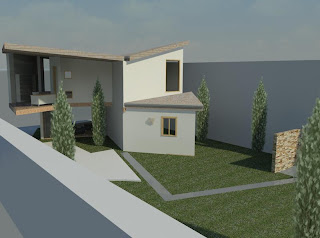
 My design is meant to portray the word aggressive through the architecture and the site design. The floor plan displays many rigid corners and penetrating walls that clash to create the aggressive feel. It represents the quick movements and spontaneous nature of the word. One who would enter the building almost has to follow the plan set up by the walls which lead you through the house from the living room and kitchen on the first floor, to the bathroom,bedroom, and study located on the second. The most difficult part of the design process was building the model to suit the needs of the client, "Madame X."
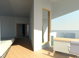
 With her odd requests, the house was to be built with both private and public spaces that were either inviting or impeding to the guests. The living room and kitchen are both apparent from the entrance way of the house, which immediately sets the public atmosphere for these two rooms. They are open and each of them has a view of the backyard. The bedroom and study were supposed to be places that guests knew not to wander into. I modeled this idea by building walls to shield the view of the bedroom from guests, while the study stands alone. The study (shown in picture above), is separated from the rest of the house by a long pathway that gives the study its serenity and privacy. From this point of the house, the best view can be achieved. It looks over the entire site and into the back yard of the house. It also had to be a design that would invite the guests to not only move throughout the house but also enjoy the garden space outside. In my design, I used a strong wall down the center to lead the guests along its axis towards the back of the site. Once outside, they can enjoy the greenery and the look of the water feature that was another request of Madame X.
Revit was a very easy program to use because a lot of the tools used for creating an object use the same steps for creating almost any other object. Loading different objects and materials used the same steps through the same dialog boxes each time, which makes the modeling process much easier. The drawing window helps you align objects to almost any other object in the picture while making it very easy to switch back and forth from different views to make sure that everything is in the right place. All of the tabs in the design bar make everything very accessible. Each one offering a different aspect, yet making it very similar to every other command in the program. The entire process from creating the property line, to erecting the walls, to capping off the project with a roof was made easy through the use of Revit. The Rendering process has been the only part of this project to really give me problems.
The first rendering to be done was the Solar Study of the house. In this animation, a camera was set up from the Northwest Isometric direction, looking down on the house. It shows an entire day from sunrise to sunset, showing which areas receive light and shadows throughout the day. The second rendering is a walkthrough of my house. Because of the length of time it takes to render one single frame in Revit, I decided to incorporate wireframe portions in my movie. I planned to use the wire frame to aid in the walkthrough of the house by using it as a tool to see through walls. Since my house has many parts that are closed off, it would have been difficult to walkthrough each corridor to view things like the bedroom, bathroom, and entire kitchen. For this reason, I was going to use the wireframe as "X-ray vision" and look through walls at the rooms I avoided in the walkthrough. I use it to see into the kitchen, bedroom, and bathroom. I also used the wireframe for its efficiency in rendering a few parts of the walkthrough that were less informative in the walkthrough process, such as a close up of the front door, and part of the walk up the stairs.
Movie1
Movie2


